PROJECTS / MOTION
Monarch Rebrand
Monarch Landscape Companies
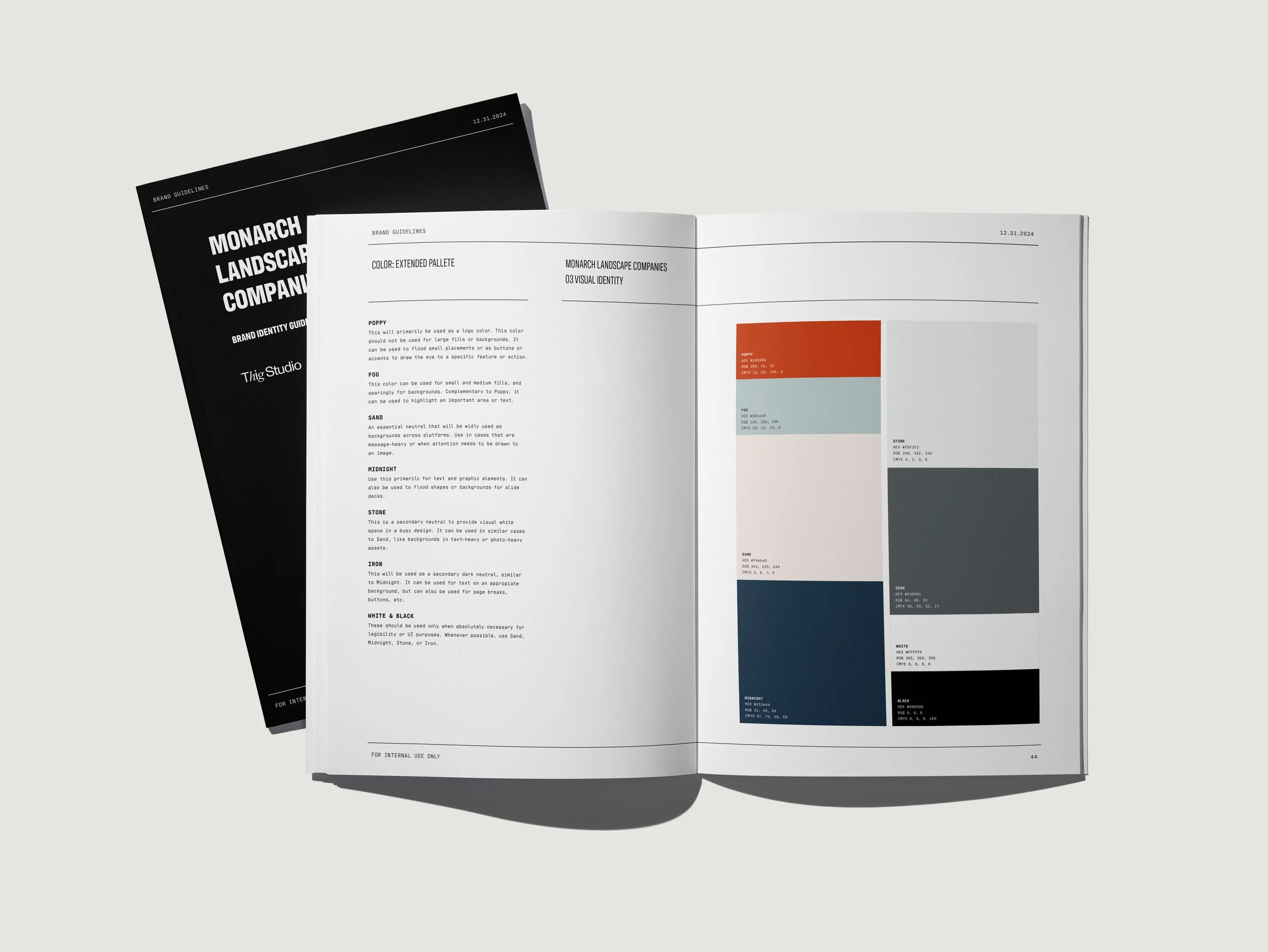
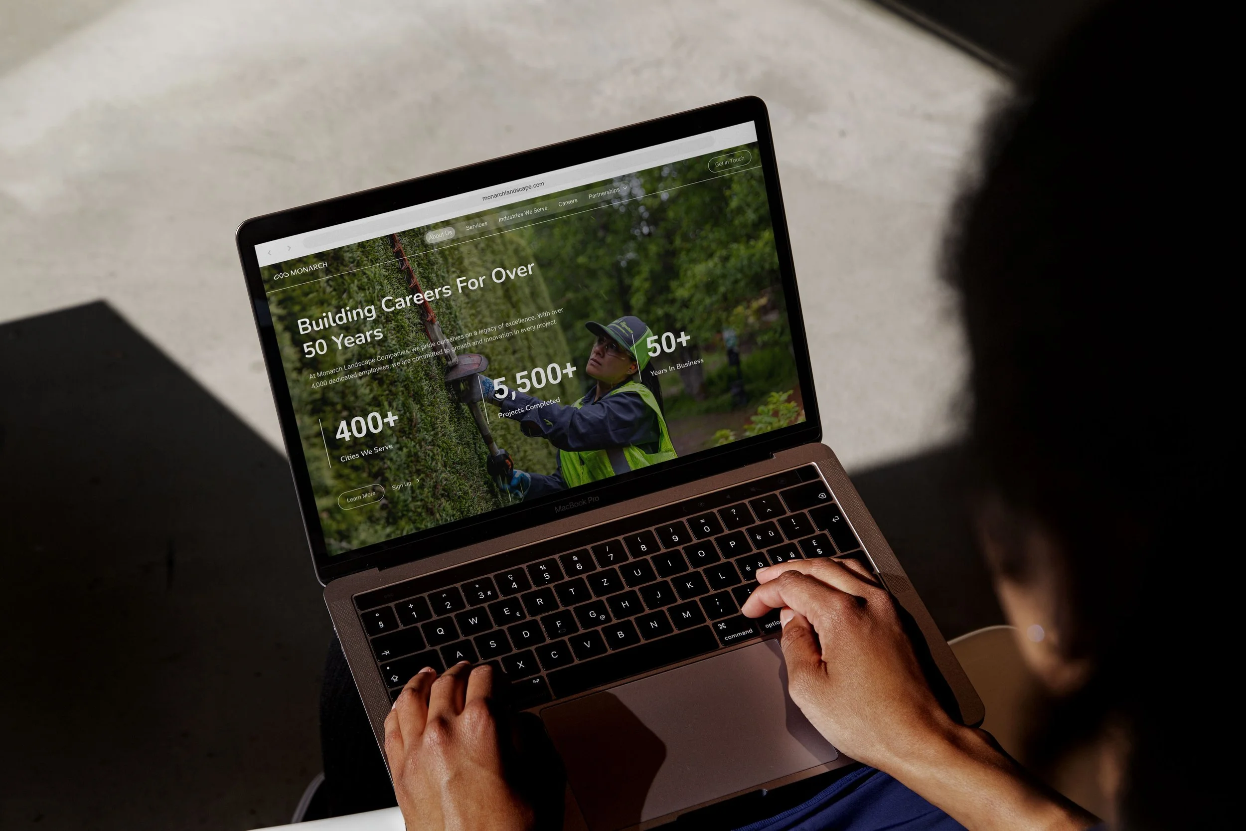
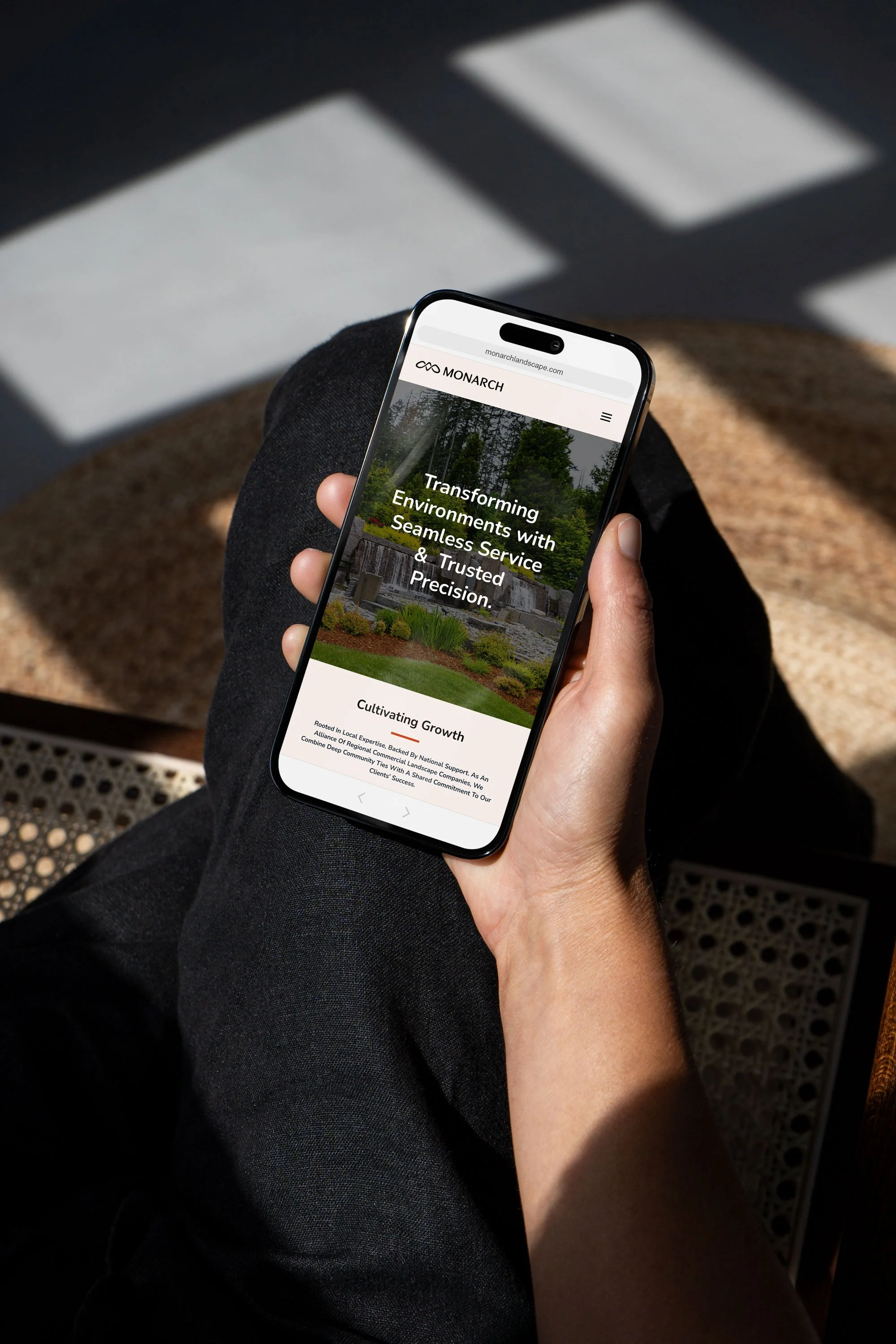
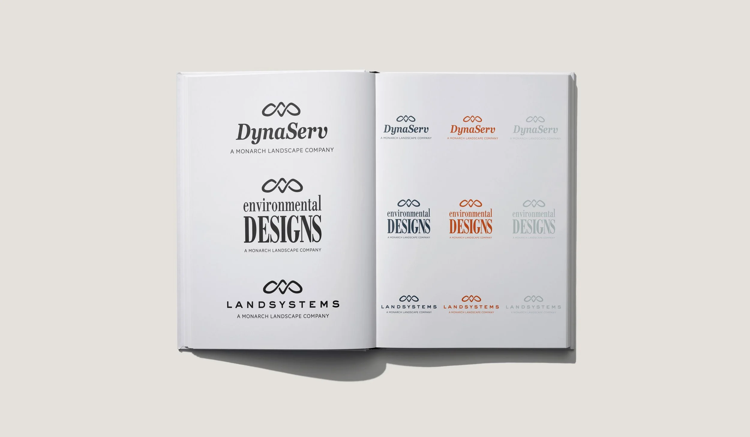
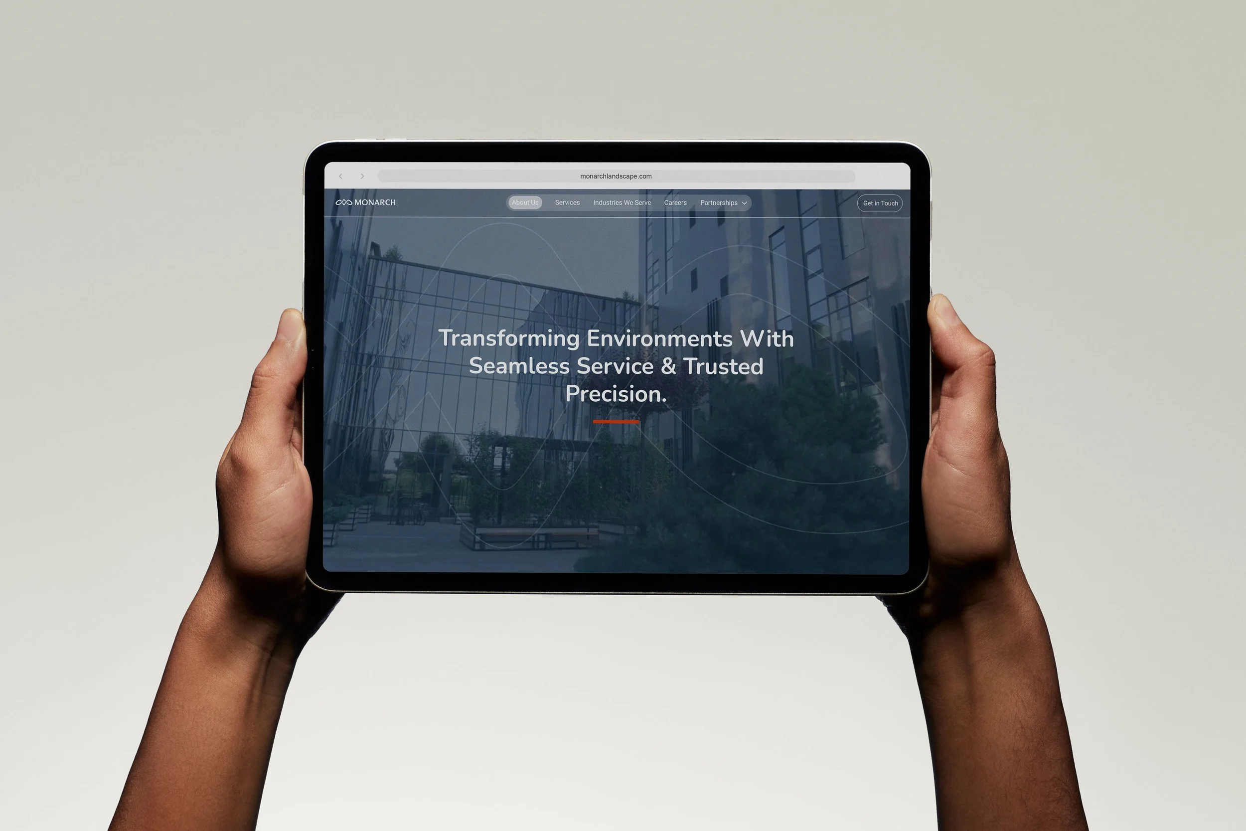
While collaborating with Thig Studio, I helped lead the rebrand of Monarch Landscape Companies, developing a fresh visual identity that included the logo, color palette, typography, photography style, motion guidelines, and collateral assets. A key challenge was creating a logo that stood out in a crowded, highly competitive market while remaining approachable and recognizable. The new identity launched with Monarch’s primary brand, followed by the rollout of updated branding across its 11 alliance companies, resulting in stronger brand recognition and a cohesive presence across the organization.
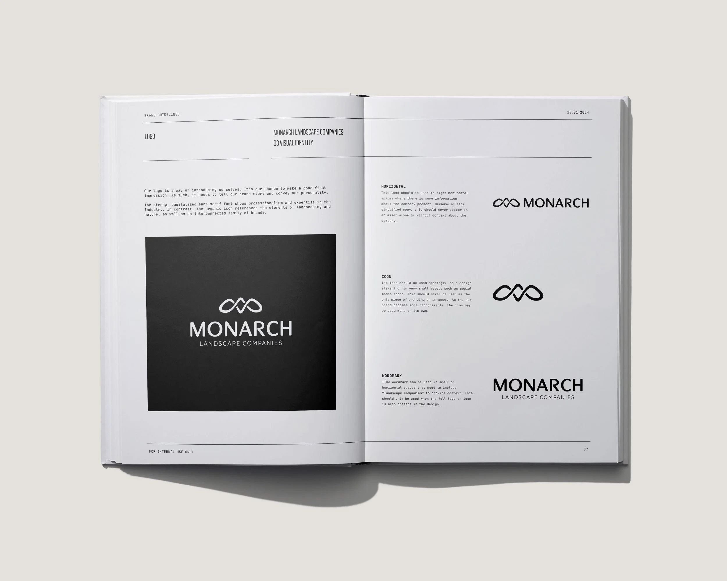
The Monarch Landscape Companies logo was designed to capture the spirit of growth, connection, and sustainability.
The abstract mark suggests butterfly wings in motion while also symbolizing interconnectivity, teamwork, and the natural cycles of the environment.
We chose a modern, professional typeface with rounded forms to balance authority with approachability, ensuring the brand felt both trustworthy and welcoming.
Through many iterations, we refined the design away from sharp or crown-like elements—steering clear of literal monarchy or insect symbolism—toward a fluid, organic form that is distinctive in a crowded market while remaining versatile across applications.